Seeing as you’re reading this, we probably don’t have to tell you the mobile game niche is fiercely competitive, or how important effective mobile ad creative and strategy is to your title's success.
Running mobile game ads that convert is no easy task, but with the global market expected to breach $100 billion next year, it’s essential to maximize your resources and think outside the box to avoid becoming another drop in the ocean.
Here’s four tips to optimize your ad creative and boost conversion rates.
Study What Not to Do
If you’ve spent any amount of time on social media, you’ll know that a lot of mobile game ads are bad. Seriously bad.
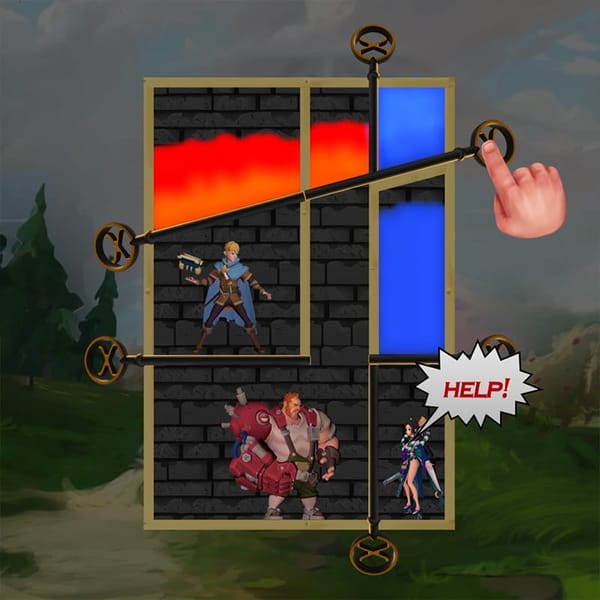
From misleading playable ads that show completely inaccurate gameplay to over sexualised graphics for wholly unrelated titles, the internet is full of poor-quality ads built to get clicks, with no consideration for other parts of the user experience.
You care about your game and the audience it’s meant for, so you already know not to get clicks using underhanded, misleading content. However, even when you’re using visual and stylistic elements that remind people of those awful mobile ads we see so often, it can undermine your title's value in the eyes of your target audience.
When you set out to create better ads, start by getting familiar with the absolute worst of the current mobile advertising landscape, especially within your game’s genre. This will give you a clear set of don'ts to avoid for a more focussed creative direction, and stop your audience from waving off your game as another cheap cash grab.
Start Ads With a Money Shot
As any mobile ad agency will tell you, the attention spans of modern consumers are lower than ever. As your audience scrolls through an endless stream of content on their devices, it’s extremely challenging for advertisers to stand out from the crowd and get those clicks.
You can’t guarantee that your ad will make everyone who sees it stop and think. However, you can maximize your chances of engagement by selecting your footage carefully, and starting your ads with a bang.
Take some time to get reacquainted with your target audience, and think about the kinds of big setpieces from your game that will align with their user motivations.
If they love to discover fantasy and sci-fi worlds, then start with a shot that shows the variety of creatures and civilizations that exist in your game. If they like to master a steep learning curve, use a clip that exhibits your progression system and the kinds of challenges players will face in the higher levels. If they want to connect with a lively community, show off your clan system or multiplayer features.
Snare your specific audience’s attention in those first few seconds, and you’ll quickly overcome that first hurdle between you and a healthy click-through rate.
Know Your Visual Style, and Stick to It
As a mobile marketing agency, we often see brands that spread themselves too thin through A/B testing, attempting to cater to several different audience segments by experimenting with different ad formats and styles.
Though testing different formats is certainly important for a successful campaign, it’s essential to make sure this doesn’t come at the cost of a consistent visual style. Your gameplay footage, branding elements, animations, and any other assets that go into your ads, should all make sense together for one cohesive style that’s instantly recognisable to anyone who sees it.
Advertising any kind of product requires a certain amount of repetition. Your audience’s first brush with your ads might pique their interest a little, but it’s unlikely that they’ll be rushing to buy your game from this first point of contact. With each new time they see one of your ads, the hope is that they’ll develop their interest a little more and a little more, with new information building on what they already know about your game to create a compelling idea of your product and a reason to check it out.
To facilitate this process, you need to ensure the visual brand of your game is consistently recognizable at every touchpoint. This will give your audience something to refer back to in order to get better acquainted with your game, and inform their purchase decision in time.
Optimize Your Content For Muted Viewing
As any Instagram ad agency or TikTok ad agency will tell you, the vast majority of video content on social media is configured to auto-play on mute.
As your audience are going to be coming across your ads as they’re passively scrolling, you need to make sure they don’t rely too heavily on music, sound effects, or spoken taglines to grab people’s attention and hold it as the ad continues to play.
When you’re crafting video content, it can be tough to mentally separate the audio track from the visual elements when you're so used to the overall experience. However, trying to put yourself in your audience’s shoes through this exact experience can help you make better-informed decisions and create ads that are perfectly suited to the platforms they’ll appear on.
When you’re reviewing long footage or particular cuts that are candidates for an ad you’re creating, make a point of viewing them muted, and concentrate solely on the visual elements. As hard as it may be, focussing on how visually striking these video sequences are to your target market, particularly in the context of a mobile-oriented ad, can help you pick out those attention-grabbing money shots and build compelling storyboards for future projects.
Content That Gets Clicks
We produce a large volume of mobile game ads, so we know how challenging it can be to build ad content that captures the minds of your audience and stays true to your game. However, by distinguishing yourself from the swathes of poor-quality content, investing heavily in the first seconds of your ad, and optimizing for your platforms, you’ll be able to get ahead of competitors and look forward to a more successful campaign.
For more support in creating ads that convert, click here to learn more about our services, and find out how we’ve helped our clients save upwards of 60% on their creative costs compared to previous agencies they've worked with.


